Dogecoin: DBeS2gHm79fHsxkYWTatbCYonxxc8fQn4M
Bitcoin: bc1qga4p8wxjvc8vx2l9p5y35ac7t0q0jqf8lmsf9y

Thursday, September 3, 2020

My Favorite Technical Trading Indicator - Trend Lines (#futures #qqq #nasdaq)


“It's only when the tide goes out that you learn who's been swimming naked.”  -Warren Buffett

If you follow any market for an extended period of time you will notice certain patterns in price action. In particular, you will notice that the market moves in waves. It is pushed in certain directions by large buyers and sellers in the markets. These large buyers and sellers have the ability to change the direction of the wave pattern. And, when they all align you get a tsunami. Just like the guy trying to find that monster wave, traders are on the look out for the same phenomena.

At what point do you know the wave is about to "break"? This is the million dollar question, because in surfing and trading, timing is everything.

One of my favorite tools to use in trading are trend-lines. Trend-lines help you to see where the "break" is.

Trend-lines are used to find the trend, but they also tell you when the trend has changed direction. That is, when another large buyer or seller has entered the market and changed the direction of the prevailing trend. If the dominant trend is up and a major player comes in and starts selling, it will push the trend in another direction. This push causes a "break" in the trend. In the world of trading this is referred to as a breakout.

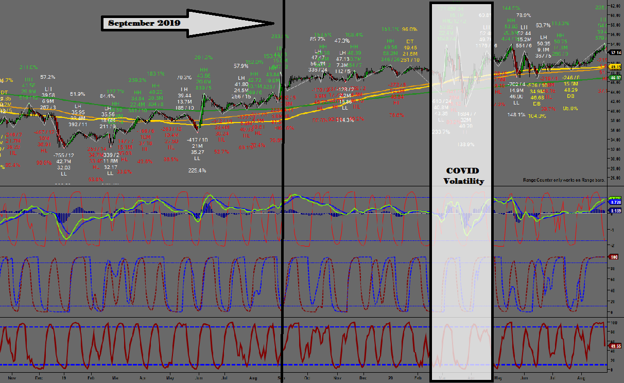
Let's take a moment to familiarize  ourselves with the following chart. This is my own chart setup on Ninjatrader 7.  We're looking at a price chart of NASDAQ futures (my favorite instrument to trade). 

For now, disregard the bottom half of the chart and just focus on the top segment. Also disregard the green, yellow and orange lines -- we'll talk about what those mean later. For now, just focus on the candlesticks and the blue lines. The blue lines are trend-lines.

At first, you will notice blue lines following the trend up and then the trend changes and starts going down.

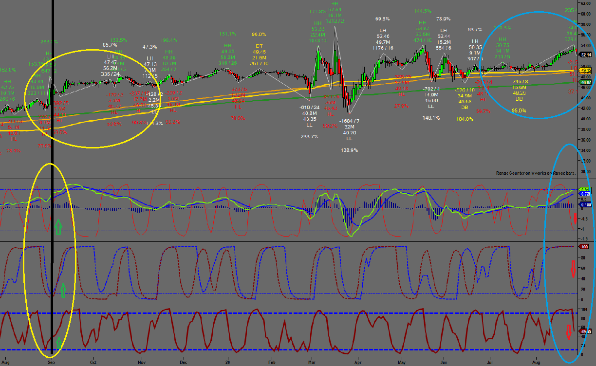
Now let's get laser focused on the first trend-line going up.


As you can see, the price bounces off the bottom of the trendline three times before finally gaining enough traction to continue upward. It doesn't quite reach the top of the trend-line before it starts trending down. This is when you start looking for a breakout.


The trendline supported the price three times before, and now it's breaking through the trend line. This breach is the breakout. Once you see the breakout, it's time to act. As you can see there are two breakouts. The first one is a breakout down and the second is a breakout up.


 Both breakouts represent an opportunity to "ride the wave".  The trend is up, another wave comes in and starts selling and changes the wave pattern down. The push is so strong that it forces the trend to change direction and that change in direction is marked by a breakout.

In trading, there is no sure thing. The best thing you can do is find an indicator that works 75% of the time. One way to boost your accuracy is by confirming the direction of the breakout with another indicator.

Now we can look at the bottom part of the chart. The breakout down is confirmed with a down movement by both of the bottom indicators. The second breakout is also confirmed by an up movement by both of the bottom indicators.


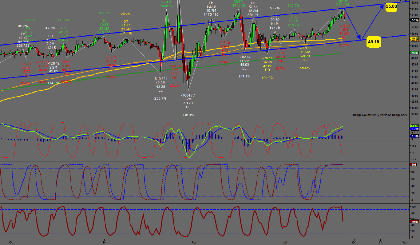
Now what? Once you find the breakout you want to place a trade with a take profit (TP) that's at least 2x as much as your stop loss (SL). For example, once I see the first breakout I'm going to place a trade with a SL of 40 ticks and a TP at 80 ticks. Some traders like to go for 3x or 4x. That depends on your risk. When you're first starting out, I think it's safe to go for 2x. This way, if you get one trade wrong and one trade right, you're still up.

This is by far my favorite set up. If you have any questions, post them in the comments below or email me at celanbryant @ gmail.com.

Good luck.


Wednesday, September 2, 2020

Campbell's Technical Analysis: Buy The Pullback (Campbell Soup Company ($CPB))


Summary
  • At a time when when the major tenants of investment valuation have been undermined, investors are looking for a confirmation -- a confirmation that the fundamentals aren't lying.
  • Technical analysts study price trends. We look for patterns that play out regardless of the asset being traded.
  • Campbell Soup has been trending up for the past 2 years, but the trend is reversing in the short-term.
  • Long-term play: Buy the pullback. Both the trend-line and the moving average converge around $49.15, which is the best place to put your buy order.
  • Short-term play: You can sell now with a take profit at $49.15. Or, you can buy at $49.15 and take profit at $55 even.

From Edo-period Japan, where traders applied technical analysis to profit from Osaka’s rice futures market, to the 1930's Wyckoff Method still taught in major trading houses today, technical trading withstands the test of time. That's because it's based on price patterns and those price patterns are based on human behavior. Specifically, trading is based on auction mechanics.

So, at a time when the major tenants of investment valuation have been undermined, is it any wonder that technical trading is gaining in popularity again?

  • How can you trust a DCF model that assumes a positive risk-free rate?
  • How can you trust a P/E ratio when companies are sacrificing dividends for stock buybacks.
  • How can you trust an economy with stock prices that move in the opposite direction of earnings? 

In other words, now, more than ever, investors are looking for a confirmation -- a confirmation that the fundamentals aren't lying.

Technical analysts study price trends. We look for patterns that play out regardless of the asset being traded. That's why technical analysis works for everything from rice in Osaka Japan to soup companies like Campbell's (CPB).

Fundamentally, Campbell Soup Company excels in both good and bad times. In other words, people find a use for its products no matter what's happening in the world.

Here's what the CEO had to say on the last earnings call:

“In the quarter, we experienced unprecedented broad-based demand across our brands as consumers sought food that delivered comfort, quality and value. This demand resulted in double-digit increases in organic sales, adjusted EBIT and adjusted EPS. In addition, Campbell’s products were purchased by millions of new households, with total company household penetration increasing over 6 percentage points in the quarter compared to the third quarter of fiscal 2019.”

We can see this upward trend play out on the technical level as well.

The chart below is split into 4 segments. The top segment is the price chart and the bottom 3 segments are the technical indicators I use to confirm the price trend. As you can see from the top segment of the daily price chart below, the company has been trending up since the beginning of 2019.

For now, let's just focus on the upper part of the chart. The black vertical line is where the company was in September of 2019. The white box is the period in time that the market rallied due to COVID. The yellow and green lines represent the moving average. As you can see, the market likes to use the moving average as a point of support and resistance. This is because institutional traders like to buy and sell at these areas. Campbell Technical Analysis 1  

Now, let's look at the bottom part of the same chart (see below). We're going to compare last year (yellow circles) to this year (blue circles).

As you can see from the price chart at the top, marked by a yellow circle, Campbell's took off in September of last year. Now let's look at the three indicator charts below the price chart. In all three charts, as noted by the green up arrows, the indicators are trending up, which confirms the price trend.

We're coming up on the same time period for 2020. This is marked by the blue circles on the right. The price is going up moving into September 2020, but it looks like it's ready for a pullback.

Now let's look at the 3 indicator charts below the price chart for confirmation. These indicators confirm that the price trend may be reversing, at least temporarily. In all three charts, as noted by the red down arrows, the trend is down or about to go down.Campbell Techincal Analysis 3  

Conclusion: It would appear as though CPBs price is trending up, but it's slightly oversold after the last earnings call so investors can expect a minor pullback. The question is how far? We can use trend lines to answer this question.

The chart below shows trend lines in blue. The trend was lost during the COVID rally, but soon returned to normal. We can use these blue trend lines to help extrapolate the price for the next 2-3 months.

Campbell Technical Analysis 3 

 As you can see from the chart below, we are at the top of the trend line, so this is a bad time to purchase the stock for optimal gain. Campbell's Technical Analysis 4 Investment Recommendation:

Long-term play: Buy the pullback. Both the trend-line and the moving average converge around $49.15, which is the best place to put your buy order.

Short-term play: You can sell now with a take profit at $49.15. Or, you can buy at $49.15 and take profit at $55 even.

Disclosure: I/we have no positions in any stocks mentioned, and no plans to initiate any positions within the next 72 hours.